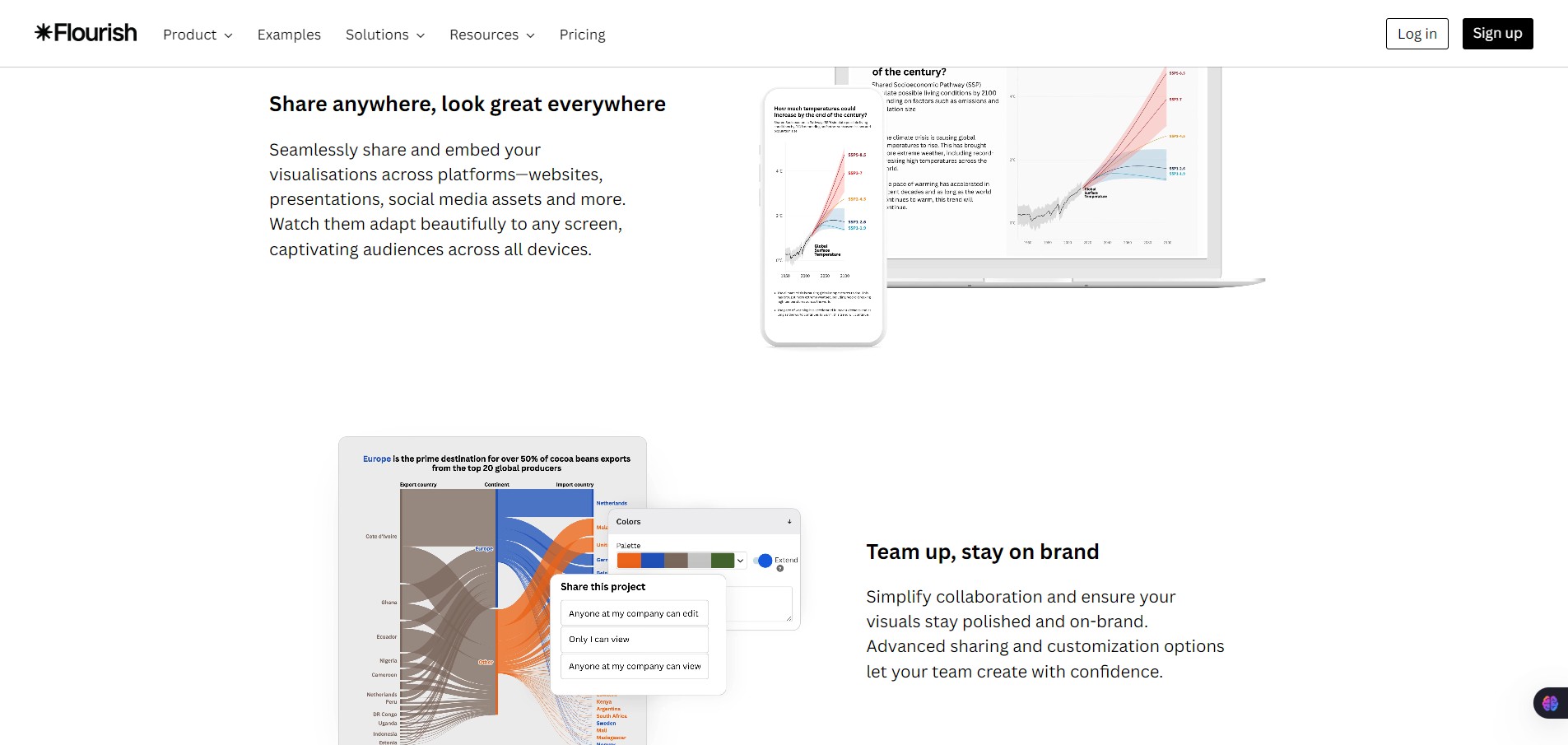
Flourish is a web-based data visualization and storytelling platform. It helps you create interactive charts, maps, and scrollytelling pieces that work smoothly on the web and across devices.
It’s widely used by media organizations, marketers, researchers, and data teams that need visuals more engaging than static charts.
Static charts often fail to hold attention or explain complex data. Flourish helps you present data in a way people can explore, understand, and trust.
It’s especially valuable if you publish content online, need to explain trends to non-technical audiences, or want professional-looking visuals without building custom code from scratch.
You upload or connect your data (CSV, Excel, Google Sheets). Choose from pre-built visualization templates like bar charts, line charts, maps, or animated stories. Customize colors, labels, animations, and interactions. Then embed or publish the result anywhere.